Nuno Marques

Product Manager/Data Analyst
Contact info:
Reach me by Email
Connect with me on LinkedIn
Download My Resume
About Me
3 Years of experience in the gaming industry, as Product & Marketing Manager and Consultant. Academical background in engineering, research, entrepreneurship and innovation. Fell in love with the more data-related aspects of Product Management after having my first experience with dashboarding and reporting to senior leadership, so I acquired a Data Analytics certification, and am looking for data focused or data-adjacent work opportunities.
Currently situated in Munich, Germany. Open to relocation or remote work.
Portfolio
Database Modelling project - SQL, data modelling, database architecture
Influenza Season Staffing Plan Development - Excel, Tableau
AirBnB Amsterdam Listings Analysis - Python(sklearn, pandas, matplotlib), Excel, Tableau
Rockbuster Stealth Customer Base Analysis - SQL
Short summary of smaller projects
Highlighted Project - Influenza Season Staffing Plan Development
- Problem: The US has an influenza season where more people than usual suffer from the flu. Vulnerable populations develop serious complications and end up in the hospital. Hospitals and clinics need additional staff to adequately treat these extra patients. It is hard to understand which states and hospitals should be prioritized when designing staff plans.
- Objective: Determine the priority states to staff, based on historical data from 2009-2017.
- Client: A medical staffing agency covering all hospitals in the 50 US states wants help to build a staffing plan for next year’s influenza season.
- Context: This project was completed in the context of Career Foundry’s Data Analytics Program. The data is real, but the scenario and agency are fictitious.
- Skills: Data cleaning, wrangling and analysis in Excel. Visualizations in
Tableau
Success Definition and Initial Brainstorming:
Before starting to even analyze the data, I needed to understand how to define success, as well as do some research on which variables could be the more interesting.
So, how do we define “adequate” staffing? According to the agency’s requirements and my own research we aimed to minimize understaffing (staff-to-patient ratio < 0.23) and overstaffing (staff-to-patient ratio > 0.27).
At the onset of the project we assumed critical parameters for influenza severity included the number of vulnerable populations, influenza death counts, and vaccination rates.
Staffing Adequacy:
Understanding which states were critical in past years would have been ideal, but we didn’t have data on staffing adequacy for those years. So, I advised the agency to start collecting data on staff-to-patient ratios and staff and patient satisfaction surveys for future planning and assessing next year’s influenza season staffing plan.
Data Collection:
I gathered data from multiple sources:
- Population data from the U.S. Census Bureau.
- Influenza death counts, hospital visits, lab tests, and children’s flu vaccination data from the CDC.
Data Cleaning:
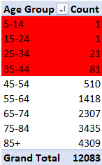
I needed to ensure the data was accurate, complete, consistent, unique, timely, and valid. Unfortunately, some datasets, like children’s vaccination rates and influenza-related hospital visits, were too incomplete to analyze further due to suppression of data for anonymization. Similarly, a lot of data for age groups below 45 years was missing from the influenza deaths dataset, as you can see from the frequency table below.
Data Wrangling:
I focused on populations aged 45 and older, since no alternative complementary datasets were found. I joined and grouped the influenza death counts and the state population data by the following common denominators: US state and month of the year (from 2009-2017). Then, I normalized influenza death counts for each state by the state populations for the respective month to prepare for the analysis.
Data Analysis – Key Questions:
I sought to answer:
- Are there any trends in the influenza season’s behavior?
- Is there a relationship between vulnerable populations and death counts?
- How do we prioritize which states to send staff to?
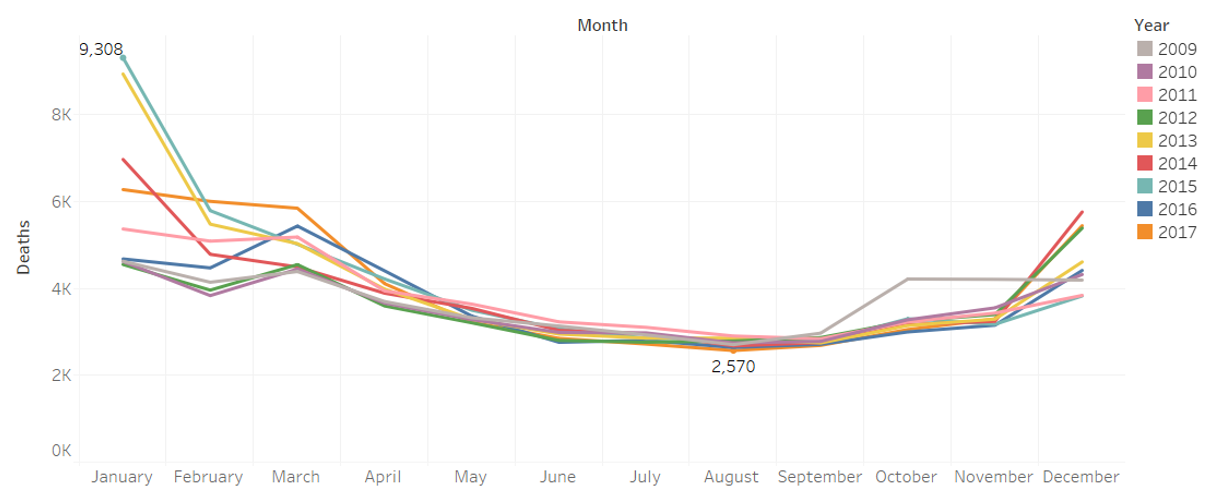
Trends in Influenza Season:
My analysis showed that the influenza season in the U.S. predominantly runs from November to March, with a peak in deaths starting in November and tapering off after March. This confirmed that influenza has a predictable seasonality
Relation Between Vulnerable Population and Death Counts:
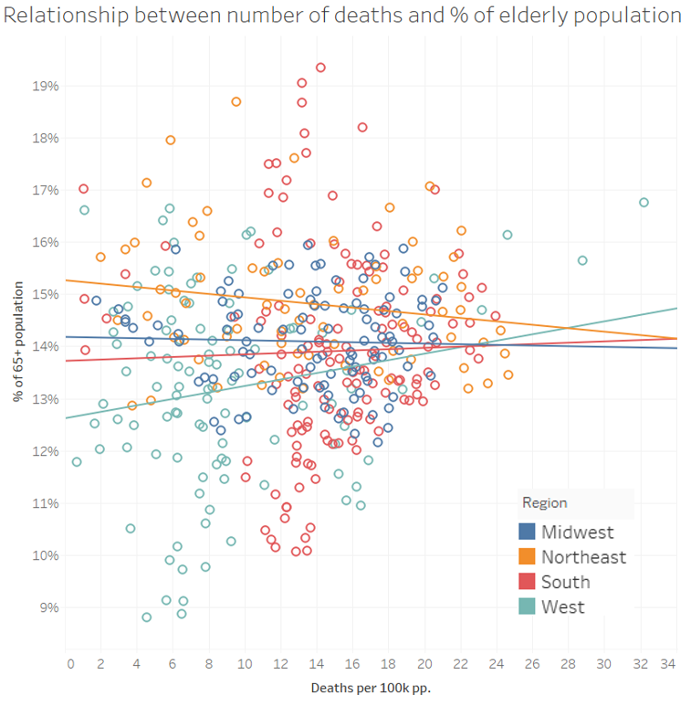
Interestingly, the elderly population (65+) accounted for 91.63% of recorded deaths.
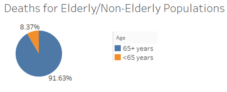
However, states with more elderly populations didn’t consistently have higher death counts relative to their population. From the scatterplot, it was evident that the trend lines were mostly flat, indicating no significant correlation. Therefore, I decided to focus on total and normalized death counts for staffing decisions instead of just vulnerable population counts.
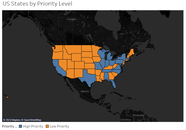
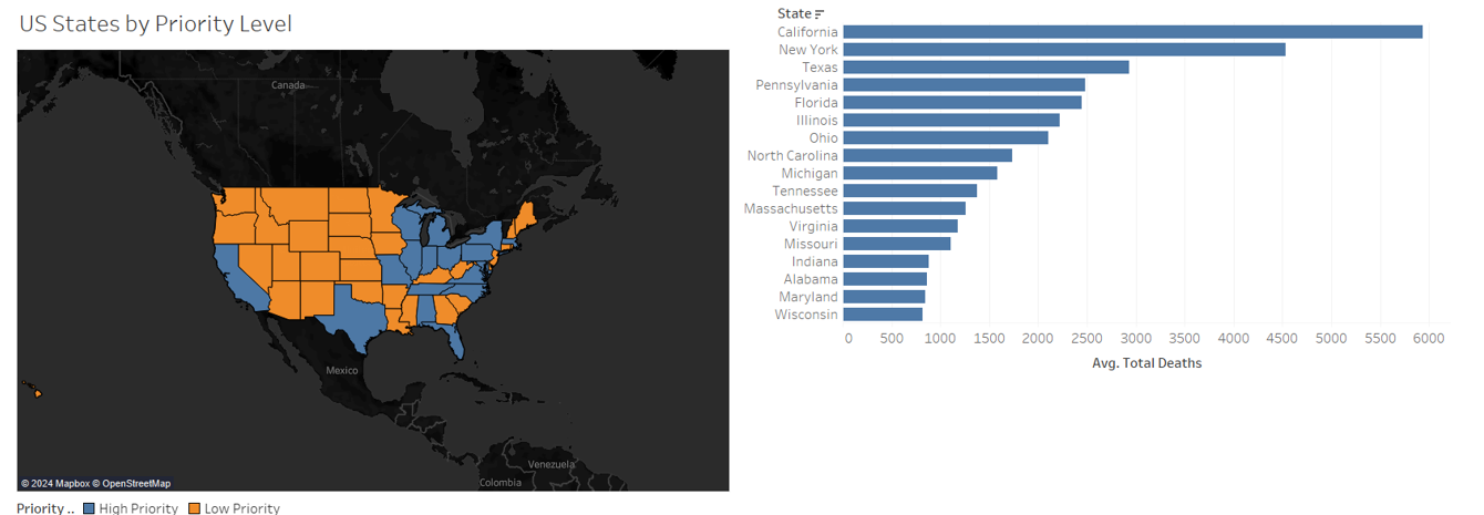
State Prioritization:
I identified critical states needing additional staff by looking at both total and normalized death counts during the peak influenza months (November-March). The data revealed that the Southern region would likely be the most critical, with higher death counts in both metrics.

Recommendations:
I presented the states that required additional staffing based on my analysis and visualized these states on a map for clarity. The top 17 priority states were identified using a mixed weight between total death counts and normalized death counts.
Conclusions & Next Steps:
- I confirmed that the influenza season lasts from November to March.
- There’s no significant relationship between the proportion of elderly populations and death counts.
- By considering higher normalized and total death counts, we identified the most critical states for staffing.
- Moving forward, we need to assess seasonality on a per-state basis, gather data on younger age groups and vaccination statuses, and plan procedures for evaluating the staffing plan’s effectiveness.
Project Retrospective:
The biggest challenges were dealing with missing data and presenting information for 51 states in a meaningful way. I learned the importance of setting up proper data collection processes and using standard data aggregation methods to make information more readable and statistically meaningful.
Supporting Material:
If you’re interested, you can check out the full analysis on my Tableau Public Dashboard and watch my Video Walkthrough of the Dashboard. Feel free to reach out to me on LinkedIn or via email if you have any questions!
AirBnB Amsterdam Listings Analysis
- Problem: Over the past decade, services like AirBnB have grown exponentially, becoming an alternative for those seeking a more local and private stay than a traditional hotel.
Nowadays, people utilize this alternative service to generate additional income by investing in rental properties. However, the rental market is highly region and time-specific
- Objective: Understand the Amsterdam AirBnB market to provide insights for prospective AirBnB hosts who have or want to have listings in Amsterdam.
- Context: This project was completed in the context of Career Foundry’sData Analytics Program. The data is real.
- Skills: Python (sklearn), Clustering Algorithms, Data wrangling & subsetting, Joins, grouping and aggregating, Data Viz(Matplotlib & Seaborn),Tableau Storyboards
Tableau Public Dashboard
Github Repository
Rockbuster Stealth Customer Base Analysis
- Problem: Rockbuster Stealth LLC is a movie rental company that used to have stores all around the world. Competition from streaming services such as Netflix and Amazon Prime, has brought them to reconsider their current business model.
- Objective: Query Rockbuster’s database to understand current clients and boost launch of new online video rental service
- Context: This project was completed in the context of Career Foundry’s Data Analytics Program. The data is fabricated.
- Skills: PostgreSQL, Database querying, Filtering data, Summarizing & cleaning data, Joining tables, Performing subqueries, Common table expressions
Rockbuster Data Set
Full analysis presentation
Data Dictionary
Page template forked from evanca